


So how did you do? Could you recall it? My guess is that you couldn't (it's red by the way). Even if your life depended on it, you probably still wouldn't have remembered. Frustrating isn't it? Google's logo is something most of us see every single day. Which means it should be easy to remember, right? Not quite...
The experiment
I'm always happy to get involved with students. I've had the chance to be a part of multiple college Q&A's in the past, and the students always seem to get a lot out of it (not to mention that it's tons of fun!). So when an opportunity to attend a career fair presented itself last month, I jumped on it!
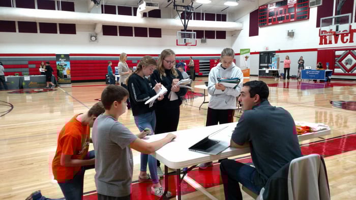
The career fair was for sixth, seventh and eighth graders taking place at the River Valley Community School in Correctionville. You could really feel the excitement in the room as these middle schoolers were given the practical steps for taking their passions and interests, and turning them into full-fledged careers.
After presenting each group of students with different job descriptions, education requirements, relevant high school courses, etc... I decided to have a little fun. Influenced by the fascinating Branding In Memory study done by the team over at signs.com, I asked the students to recreate four popular logos from memory.
The logos I chose were, Apple, Pepsi, Nike, and Instagram. Oh, and to up the ante a bit, I decided to pick a winner from each grade who would be awarded an oh-so-envious Antidote 71 t-shirt. As you can imagine, the competition was fierce.
A bit tougher than expected
A few minutes of demoralized sighing and hesitant scribbling later, and the results were in! It turns out that (surprise, surprise) they had a tougher time than expected. Here's what the results ended up looking like...
![]()
THE PEPSI LOGO.
The Pepsi logo was by far the hardest for them to recreate. Most of them drew the old logo with the white wave in the middle. Although every one of them knew that it was a circle and the colors were red, white, and blue.
THE APPLE AND INSTAGRAM LOGOS.
These logos were a bit easier for them. I think the reason for that is because they're the most popular brands among the four. Lots of the students had Apple phones, and almost all of them were Instagram users. Although that doesn't mean there weren't any mistakes... common themes included the bite being on the wrong side of the apple and the little camera lens being drawn on the wrong side of the camera.
![]()
THE NIKE LOGO.
Most of the attempts at the Nike logo ended up looking more like an oblong checkmark than anything. Some of them also drew it in reverse. All and all, not quite as simple as expected.
What else aren't you seeing?
This experiment turned out to be very fun for all of us. We certainly got a few good laughs at some of the attempts. But this was more than just a fun little exercise. Our experiment, and the study that inspired it, expose a lot of very compelling questions for business, marketing, and even human psychology.
And while diving into all that is far beyond the scope of this blog post, my hope is that at the very least, this inspires you to pay a little more attention to the things you overlook in your own life. I know it's done that for me.
Interested in some help with your brand?
We love working with business on branding, design, lead generation, digital and social marketing—and more! If you'd like to talk to us about where you're at with your marketing—and where you could be, use the button below to request a consultation. Just shoot us a note and we'll go from there!


GET A FREE BRAND AUDIT NOW!
|
Do you know what your brand is really saying? And if it's saying what you want it to? Our brand audit examines:
|

