Somewhere along the line, people started to believe that for a lead generation campaign to work, it had to be basic, utilitarian, and functional. That design didn’t matter.
As a creative and digital agency, we see our share of bad websites, landing pages, and lead gen offers. After all, clients wouldn’t be looking for help if everything was perfect (but if you have a great site and are looking to continually improve, kudos to you for the initiative!).
“GOOD ENOUGH” ISN’T ACTUALLY GOOD
As a creative and someone who enjoys great web experiences, I’m becoming more and more concerned with the trend of ‘just good enough’ website redesigns. You know the kind, we’ve all seen them. A company hires an agency specializing in ‘bringing them tons of leads’ and clicks, but the site looks clunky, intrusive and gives the user the shady used car-salesman vibe.
Here’s the thing: your lead gen program doesn’t have to be ugly. It can, and should, be a positive experience for your users that builds on your brand and earns your customers trust—all while driving you leads.
INTRUSIVE UX WON’T GET YOU RESULTS
Pop-ups you can’t close, chat windows that keep expanding when you’re trying to read and distracting buttons that take up too much space.
If you’re nodding along while reading that sentence you’re not alone. They’re obnoxious, but unfortunately common tactics websites employ to try to capture leads. Here is where I’m torn between good design and marketing.
Those elements actually work and can be effective tools for companies when used sparingly and in a non-intrusive way. I think trusting users to act on those items when they are ready is a more effective solution. Your users will see the chat icon at the bottom of your website, and they’ll click on it when they actually want to use it. Until then, leave them alone and let them come to their own conclusions.
You’re trying to earn their trust and business, not force them to click on something they’re not interested in just to get rid of your pop up.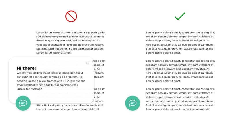
SHADY SALESMAN EXPERIENCES ARE THE WORST
Here’s another great example of a good thing turned sour by poor design and shady schemes.
You want to read that white paper or download that checklist? Better be prepared to fork over your email and possibly some other info. And a lot of times, be ready for disappointment. Cue the SPAM folder filling up your email, all for a lazily typed out PDF you could have found on Google.
You should provide value to your prospects; and things like white papers, checklists, and workbooks can be great resources for them! The value of what you’re offering has to out-weigh the information you’re asking for.
And follow up with relevant offers related to what they downloaded. Not a hard-close sales pitch. Not everyone is ready for that after downloading one piece of content.
Make your content valuable and unique. Make it something they will want to download and come back for more. And by all means, make it look good as well as provide useful information.
GREAT DESIGN MAKES LEAD GEN WORK HARDER
At Antidote 71, we strive to combine the power of lead gen with great design.
Good design without strategy and purpose behind it is just something pretty to look at.
Lead gen and strategy without design can seem intrusive and cold.
Neither provide your customers with anything of value. But when you put them together, that’s where things start to get interesting.