


It’s that time of year again! No, not New Year’s resolutions but the unveiling of the Color of the Year for 2022 from Pantone. This year, Pantone has released ‘PANTONE 17-3938 Very Peri’ as the color for 2022. So, let’s talk about the color, it’s characteristics and how to use it!
17-3938 Very Peri
A New Pantone Color Whose Courageous Presence Encourages Personal Inventiveness and Creativity’
Very Peri is in the cool blue family and conveys feelings of calmness, relaxation, and trustworthiness. Although, it leans into the violet undertones giving it an encouraging and motivational effect. This is exactly what Pantone was going for during the creation of Veri Peri. Leatrice Eiseman, Executive Director of the Panton Color Institute, says, “… very Peri displays a spritely, joyous attitude and dynamic presence that encourages courageous creative and imaginative expressions.” Very Peri is also a great example of how color trends in the digital space are making their way into the physical world. It’s a versatile color that renders great on screen while also showing true in print and as a material. Be on the lookout for this color to start popping up in stores and moving beyond the screen.How to Use Very Peri
While Very Peri is an adaptable color with both digital and physical applications, it can also be paired with a variety of different colors to set some very distinct moods. Let’s look at a few of the recommended palettes and combinations from Pantone.
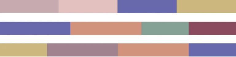
Natural Pastels
Mixing warm and cool natural tones creates a sense of unity and calmness. Very Peri is the bridge between the warm tones (orange, red, yellow) and the cooler ones (green, violet).

Coming this Spring
Using different nature shades (greens) along with Very Peri can give vibes of growth and healthiness. Expect to see lots of these combinations the closer we get to spring and Easter in social graphics and advertisements.

‘Pop’ of Color
So far, Very Peri has been used to balance out the palettes and make them work together. But what if we make it the hero? When it’s surrounded by neutral colors and allowed to shine it can create a sense of elegance and classiness.
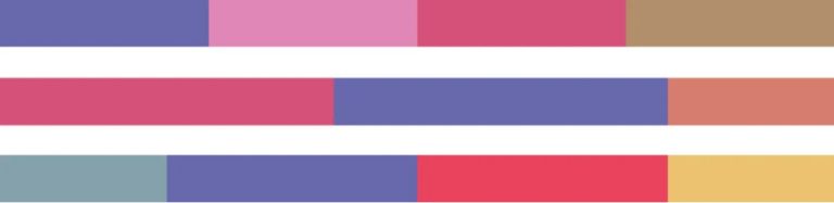
Brighten Things Up
When used along with other bright and warm colors, Very Peri becomes a bright, fun and energetic expression. Don’t be surprised to see this on swimsuits and patio furniture this summer as the weather brings out the smiles and tiki drinks.
What Will We See Next Year?
As we look at what Pantone has given us for 2022, I like to try and read the tea leaves to see what they will do for 2023. For the last few years, there has been a clear trend of light, somewhat muted, pastel colors (excluding 2020… which I think we should exclude all together). As with all things, there must be a balance. For this reason, I think Pantone will go in the opposite direction by giving us a more solid, bolder color. It’s also worth noting that we haven’t seen a green hue on the list since 2017, or a true red hue since 2012, so something in those two ranges is my guess.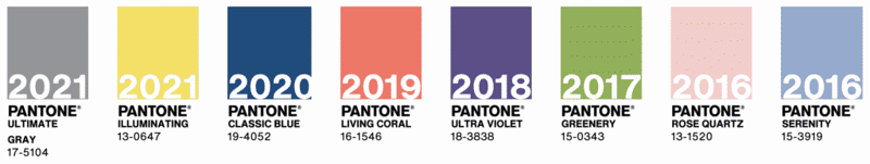 I look forward to coming back to this post in a year to see how close (or far off) my prediction is. What are your guesses?