



Website design trends move quickly. Some disappear almost as soon as they arrive. Others stick around because they solve real problems.
Our favorite trends in 2026 fall into that second group. They give designers new ways to organize information and guide people through a site. And when used intentionally, they can make the user experience more memorable.
Here are the trends our team keeps coming back to.
Bento Boxes Still Dominate
Bento-style layouts have been everywhere for the past few years. They are still going strong in 2026 for a simple reason: they make large amounts of information feel manageable.
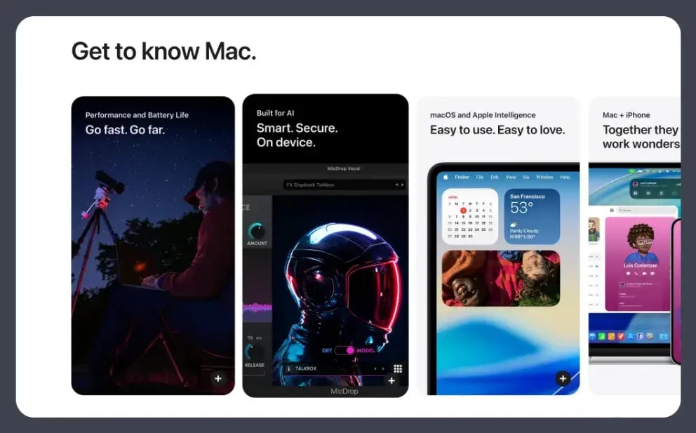
The layout divides content into individual cards or containers. Each box can hold a feature, statistic, image or product benefit. Together, they create a clear visual hierarchy that helps people scan the page and decide where to focus.
Apple uses this approach throughout its product pages. A section like “Get to know Mac” can cover performance, AI features, device compatibility and more, without becoming a wall of copy.
Glassmorphism Adds Depth
Glassmorphism is a UI design style that uses translucent, blurred “frosted glass” panels over colorful or complex backgrounds to create depth and visual hierarchy in digital interfaces.
The style is hardly new, but it has become more refined.
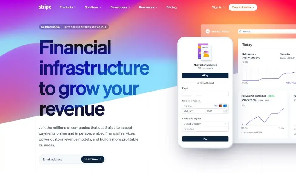
Instead of covering an entire website in glass effects, designers are using them to establish hierarchy. A translucent card can separate a message from a colorful background without hiding what sits behind it. The result feels layered without becoming visually heavy.
Stripe offers a good example. Its gradients create energy while the lighter interface panels give the page structure. The design has plenty of color, but the content still feels organized.
3D Products Move With the Page
Apple helped popularize scroll-based product animation years ago. Now it is difficult to browse modern product sites without finding some version of it.
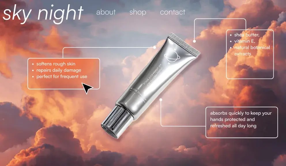
A shoe rotates as you scroll. A device opens to reveal its screen. A piece of equipment separates into components so you can see how it works. These experiences let people explore a physical product before they ever touch it.
That is what makes 3D valuable. The movement can explain the product. It can reveal materials, highlight features or show how different parts interact. Scroll-driven animation gives the visitor some control over that story since the object responds to their movement through the page.
The tools behind these experiences have also become more accessible. Designers can now build smooth 3D interactions with WebGL and newer browser animation capabilities. What once felt limited to brands with Apple-sized budgets is showing up across the web.
Type Is Becoming the Main Visual
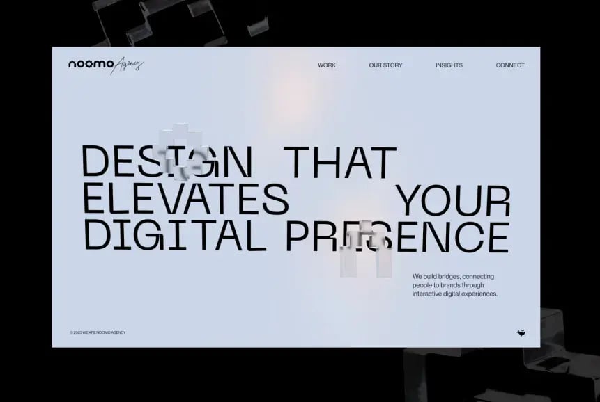
For years, the default website hero paired a headline with a large photo. In 2026, more brands are letting the headline become the image.
Oversized type can establish personality before a visitor sees a single photograph. The font, scale and arrangement of the words all become part of the brand experience. That makes typography especially powerful for service businesses or digital brands that may not have an obvious physical product to feature.
The shift also puts more pressure on the copy. If the words take up half the screen, they need to earn the space.
This is one of the reasons we like the trend. It brings messaging and design closer together. The copy is no longer something placed into the layout after the visual direction is chosen. It helps create the visual direction.
The Story Can Start in the Navigation
Navigation is usually designed to disappear. It should help people move through a site without asking for much attention.
That assumption is beginning to change.
Editorial-style mega menus are turning navigation into an experience of its own. Large visuals, animated cursors and interactive project previews can begin telling the brand story before someone opens another page.
The Siena Film Foundation site uses navigation inspired by classic cinema tickets. The menu supports the site’s film portfolio aesthetic while giving the experience an instantly recognizable feature.
Gianluca Gradogna’s portfolio takes another approach. Images of his work appear within the menu, giving visitors a visual preview of the portfolio while they decide where to go.
These menus stand out because the creativity grows from the content. The goal should still be clear navigation. The experience becomes memorable when the interaction also feels like part of the brand.
Static Images Are Starting to Feel Very Static
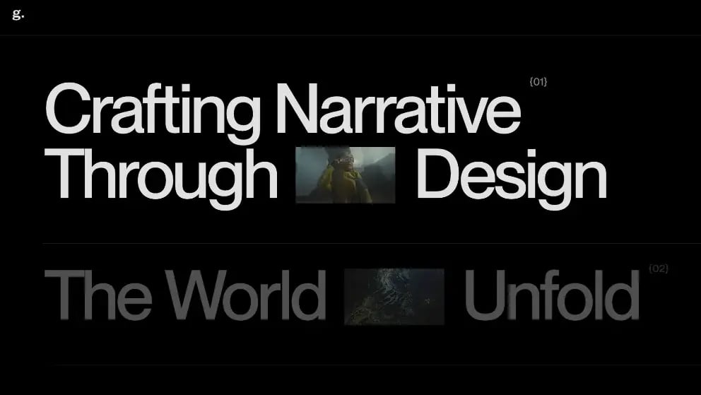
Image animation may be the clearest thread running through website design in 2026. Photos reveal themselves on scroll. Project thumbnails respond to the cursor. Still images turn into short videos when someone hovers.
The effect can make a page feel alive. It can also guide attention by showing people where to look next.
Vendredi Society uses motion throughout its site, including animated project previews and transitions synchronized with scrolling. The animations offer a closer look at the work before the visitor opens a full case study.
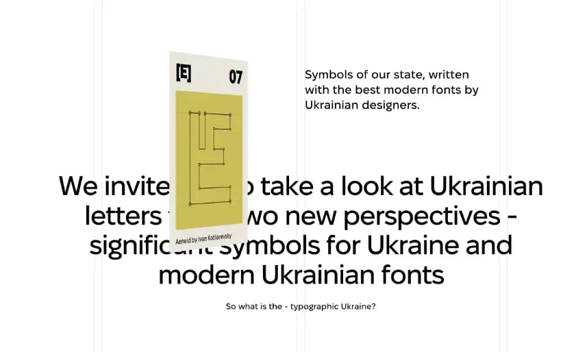
Abetka uses image transformations to pull visitors through areas of white space and into the next section. The movement gives the page a sense of continuity that static images would struggle to create.
This trend comes with an obvious warning. Too much movement becomes distracting. It can slow down the experience or make basic information harder to find. The best image animation is subtle enough to support the page while still giving the visitor something unexpected.
The Best Trends Still Have a Job to Do
A website can include bento boxes, glass effects and animated 3D products without becoming any easier to use. A trend only earns its place when it helps communicate something. Used well, they can make a website feel current while helping visitors understand what matters.
And that should always be the goal.